Brian Hoff Design

WE RESHAPE, RETHINK, & REDEFINE DIGITAL EXPERIENCES

Thank you for contacting us. We will be in touch with you very soon.

Oops! Something's not right.

Make sure you entered your email address correctly.

  • Practice Ignition
  • Outbrain
  • Whiteboard
  • Matchbox
  • KiteBrite
  • ClearStats
  • Breadcrumb
  • Mojo Themes
  • 80 Spaces


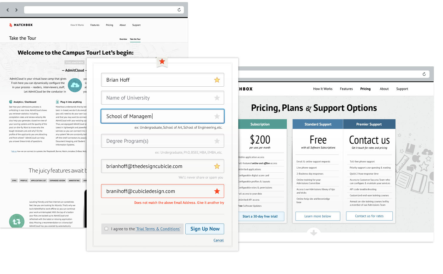
Welcome to Brian Hoff Design

At Brian Hoff Design, we believe that great design goes beyond just looking good—it's about creating seamless, intuitive, and meaningful digital experiences. We specialize in crafting responsive websites, innovative user interfaces, and powerful branding solutions that not only engage but also deliver results.

What We Do

Whether you need a stunning new website, a mobile application, or a complete brand overhaul, we've got you covered. Our team of expert designers works closely with you to understand your goals and vision, creating customized solutions that align perfectly with your brand's identity and target audience. We focus on:

  • Web Design & Development: Crafting visually appealing and highly functional websites that look amazing on any device.
  • UI/UX Design: Designing intuitive interfaces that enhance user experience and drive engagement.
  • Branding & Identity: Building strong, memorable brands that resonate with your audience and set you apart from the competition.

Our Approach

Collaboration is at the core of our process. We partner with you every step of the way to ensure the final product meets your exact needs. From concept to launch, our team is committed to delivering creative solutions that work.

With a keen eye for detail and a focus on usability, we make sure every design choice enhances the user experience while reflecting your brand's personality and goals. Our responsive design ensures that your digital presence looks flawless on all devices, from desktop to mobile.

Why Choose Us?

  • Tailored Solutions: No two projects are the same. We tailor each design to your unique requirements and objectives.
  • Expert Designers: Our team has years of experience in creating high-quality, user-centric designs.
  • Proven Results: Our work speaks for itself. We've helped countless businesses enhance their online presence with creative and functional digital solutions.

Let's Create Something Great Together

Ready to transform your digital presence? Contact Brian Hoff Design today, and let's build something extraordinary that drives results and leaves a lasting impression.
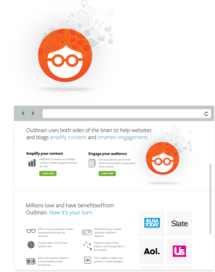
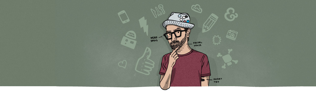
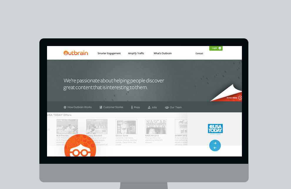


Practice Ignition

Practice Ignition

We dread accounting, so we did our part to ease the communication between firm and client. Carry on ‘forward-thinking business’, carry on.

Practice Ignition

An adaptive process

Practice Ignition came to us to craft their vision. The interface, marketing site, a mobile strategy, branding... the whole shebang. Our data visualization skills were put to the test as Practice Ignition shows users at a glance their latest activity, deadlines, open jobs, tasks due and a handful of other features with beautiful graphs and numerical imagery.

Mobile first

The first step to creating a successful collaborative platform that enables accountants to maximize their engagement with their clients was creating an interface you can access from anywhere. We went with a mobile first approach and scaled it out to the desktop. This gordeous beauty lives on every device.

Branding and Marketing

Typically we’ll start on the branding and identity. This time we took a slight turn from our typical process and started with the interface. While designing the visual elements, one of the charts became the iconography for the Practice Ignition ‘p’ logo.

Primary Logo


Outbrain

Everyone has a story worth telling. Outbrain was just having a little difficulty sharing and clearly communicating theirs.

Outbrain Arrow Arrow Arrow

If she only had a brain name

Outbrain is well known for driving more effective website engagement and helping publishers -- like USA Today, The Slate, AOL, and US Weekly -- to acquire more traffic. But they were struggling with their message, personality, and some good old-fashioned smarts! We started by bringing life to “Outbrain Girl” and gave her a proper name. She’s the heart, soul, and brains of the operation. Say "Hello" to Amelia.

Brain power

As Outbrain outgrew their previous site while growing as a company, a primary dilemma for them was communicating and structuring a site around two audiences: marketers and publishers. How did we help one company speak to two groups of people on one website? With some good old-fashioned brainstorming, clever copy, and site re-structuring. But we then discovered that people are at their best when they use both sides of their brain. So by focusing less on the audiences and more on the benefits to each, Outbrain grew even smarter.

Communicating the benefits

One of the main problem areas we diagnosed with their old site was lack of communication to understand what Outbrain did and how it would benefit its users. Great companies like USA Today and US Weekly were already using Outbrain, but we helped them answer the “How can I benefit?” and gave them the results, too.

The proof is in the pudding

The case studies allowed Outbrain to share their clients' stories. (Mmmm, did someone say pudding?!)

Animated character bouncing
time
Page views
The Neend for Steed

The Need for Steed

The Steedicons icon set – created by the talented hand illustrator Kyle Steed – happened to exude the charisma Outbrain was asking for. The nerdy – nerd is the new cool, if you haven’t heard – icons aided in visually communicating Outbrain’s story. They were the tape to Amelia’s glasses, and the wits behind the smarts.

Beauty Brains

We crafted an experience that not only looked good on the outside, but had the smarts to back it up


Beyond the whiteboard

Beyond the Whiteboard

How do you encourage CrossFit’ers to build strength? Forget the ‘Likes’ – we needed to create an interface that gets them pumped!

Beyond the Whiteboard

How we did it

Clients usually ask us, “So, what’s first?” Once we began working with Beyond the Whiteboard, we immediately knew we needed to comb through the unnecessary elements and simplify the essentials. So we started right at the core – their brand identity – and worked our way out to the user interface.

Fist pumps and chest bumps

Initially, Beyond the Whiteboard was looking for a refresh of their web app, but we had bigger things in mind. We gave them an adaptive interface that’s just as lovely and easy-to-use on mobile devices as it is on desktops. We completed the work with a stunning visual analysis of users' progress, custom workout creation tools, and timeline profiles that track workouts and relationships.

sweat the details

Client Hug Tracker*

On average we received 4.2 hugs per week while working with Beyond the Whiteboard

Heart shaped icons
Heart-shaped icons

*We know what you’re thinking: No we don’t work for hugs, but they do make us work better. Get in touch.


Matchbox

Matchbox

Matchbox was founded to transform the university student admissions process. We were brought on to ignite their marketing site.

matchbox steedicon flourish

Re-sparking a great brand

Matchbox Admissions was in the midst of a rebrand when they came to us. They needed something that sparked the future of the university-admission process. AdmitPad was renamed to Matchbox, and we took over from there starting with a new, hot identity that plays on the digital flame and box concept.

In need of a home screen

Their beautiful iPad app, which was designed by Matthew Smith, needed an identity and mark that would migrate seamlessly over to the iPad’s homescreen. The fiery red we used was a sure bet to light up the screen, while the subtle texture of a campus map and lighting effects brought an authentic flair.

Small details

We take pride in the small details. Fixed navigations, dynamic scrolling, clever form validation, charismatic button copy ... no detail was left unattended. We nurtured each creative element through launch.

Big Impact

Matchbox

Knowledge empowers

We know first-hand what the power of social media can do for a business. We had big ideas for the Matchbox blog when we turned it into a learning and discussion bulletin board of information – not just company news.

“Really superbly crafted website design. Each page has been treated with utmost care. Like in case of the features page it has been treated with a fixed header because of the length of the content in this section, where in each of the other pages the header is not fixed like that. That’s only one detail of many many more you should check out on this site.”

matchbox headshot

Kitebrite for iPhone

Kitebrite

An iPhone app to float ideas and upcoming plans to friends? Where do we sign up?

Kitebrite

Setting sail on a new identity

The Kitebrite team had high hopes for their app, but were struggling to realize its full potential. The concept of sharing plans, posting ideas, and gathering location-based suggestions needed an uplift. So we focused our initial efforts on rebranding and refreshing the logo, which later worked itself into the iPhone-app icon. Now Kitebrite was starting to get its feet off the ground.

High as a kite

The challenge was to develop a UI that was enjoyable and painless. While reorganizing and rethinking the existing user experience, we concocted the new interface to be loaded with user-enabled imagery that matched their plan or idea. We also included shortcuts for easy updates, gestures that’ll keep fingers happy, and pixels that look good enough to snack on. We wanted Kitebrite to soar higher than any other kite out there.

So what's the plan?

Users can customize their plan's photo using their iPhone’s camera, or they can upload directly from their photo library. And all while setting the time and location easily, inviting their Kitebrite friends and groups to tag along, and allowing friends to set a timeframe and “loop in” other friends.


ClearStats

ClearStats

How do marketers want to track their Twitter trends, monitor their competitors, or manage their social inbox?

ClearStats

Simply and beautifully, that's how

ClearStats approached us with an idea that needed nurturing and guidance. ClearStats evolved into a simply enjoyable interface thanks to a balance of the right details in the right places, elegant data visuals, and a carefully articulated user experience.

ClearStats ClearStats

Encouraging clicks

We wanted to create an experience that was just as gorgeous on the outside as on the inside. We designed an experience that delighted users beyond the clicks.

Land on the big screen. Carry on in your pocket.

Originally, we set out for a desktop-only version of ClearStats marketing site. But hell, it transitioned naturally into a mobile version. So we threw in a few enhancements to make use of a touch interface.

ClearStats
ClearStats

Dribbblefun fact